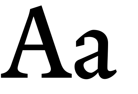
Merlo is an interpretation of the 18th-century’s typefaces from the Spanish punch cutter Juan Manuel Merlo, showcased in Muestras de los punzones y matrices de letra que se funde en el obrador de la Imprenta Real, Madrid, 1799. Juan Manuel Merlo’s typefaces exhibit influences from northern Europe and were perhaps produced using matrices acquired from Plantin. Merlo is a pure book typeface and with only a Roman and an Italic.
Merlo is part of our Iberian historical series, along with Eudald News, Rongel, and Geronimo (available through The Enschedé Font Foundry).
Styles included:
OpenType Features:
Case-Sensitive Forms
Small Capitals From Capitals
All Small Capitals
Standard Ligatures
Proportional Lining Figures
Proportional Oldstyle Figures
Tabular Lining Figures
Tabular Oldstyle Figures
Numerators
Denominators
Fractions
Ordinals
Stylistic Alternates
Inferiors
Superiors
 Small Caps
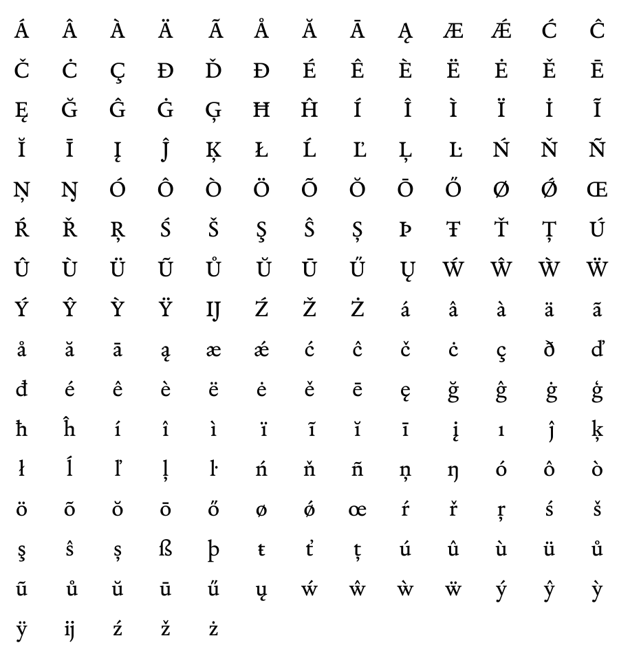
 Accented Upper / Lowercase
 Accented Small Caps
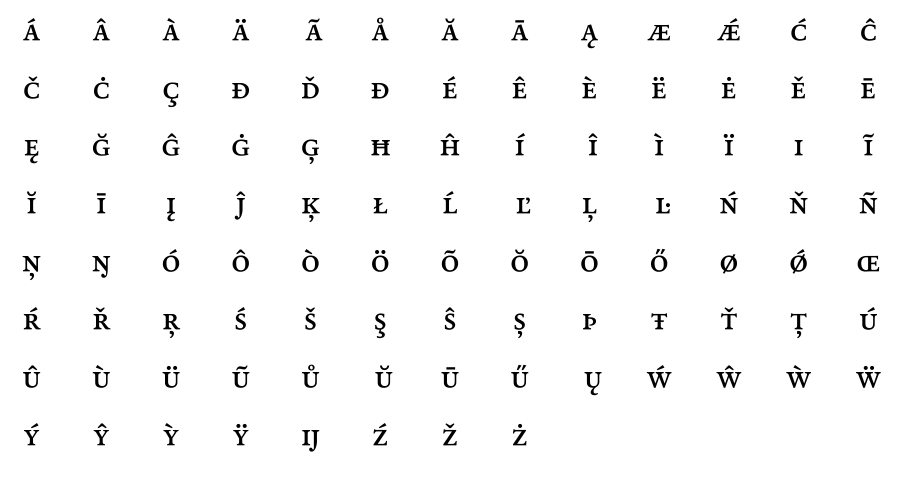 Alternates / Ligatures
 Numerals / Fractions
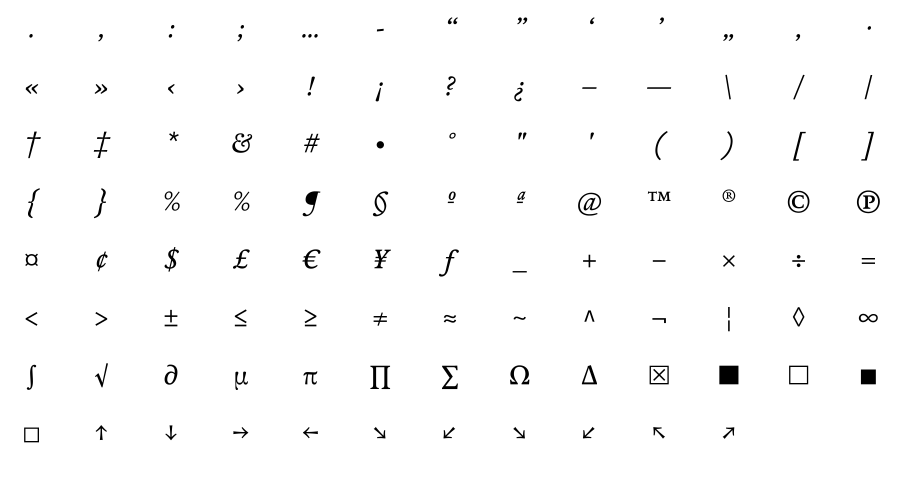
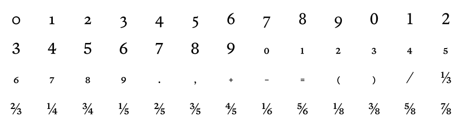 Punctuation / Symbols
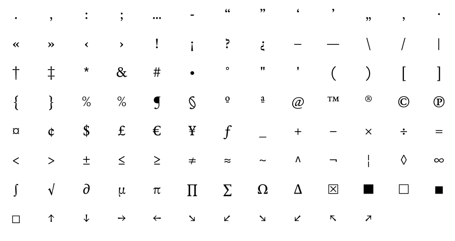
 Italic
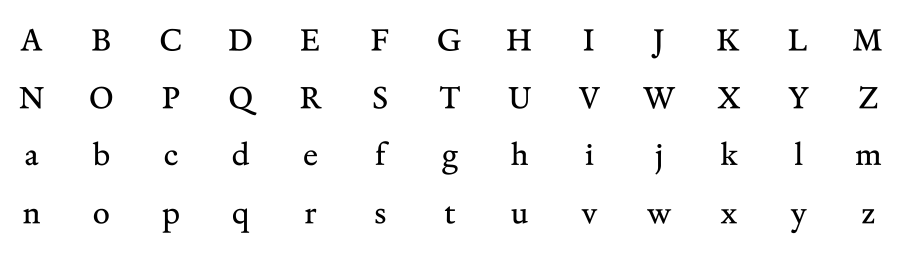
Uppercase / Lowercase
Italic
Uppercase / Lowercase
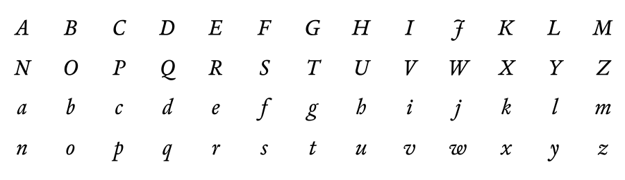 Small Caps
 Accented Upper / Lowercase
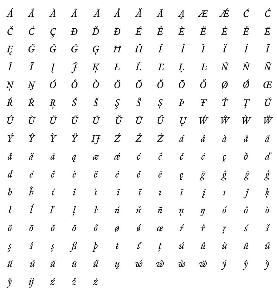 Accented Small Caps
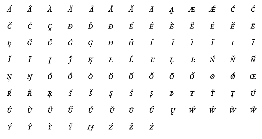 Alternates / Swash / Ligatures
 Numerals / Fractions
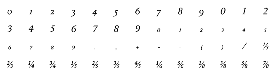 Punctuation / Symbols