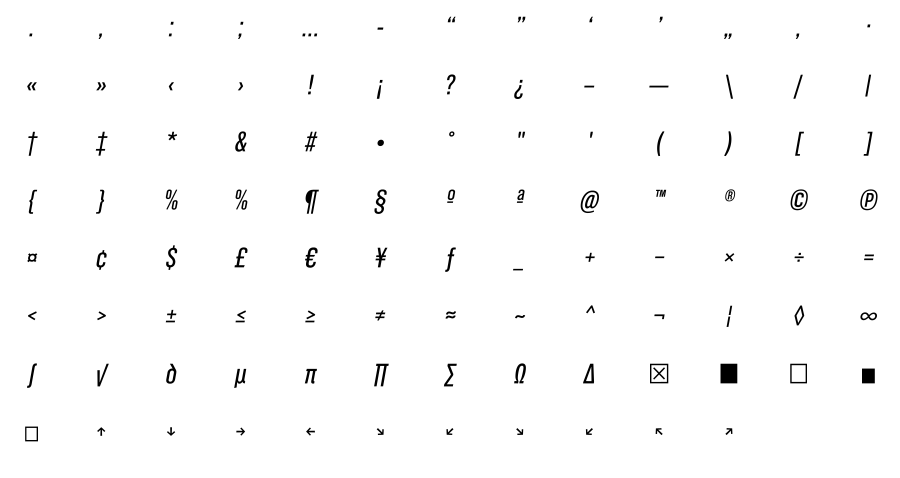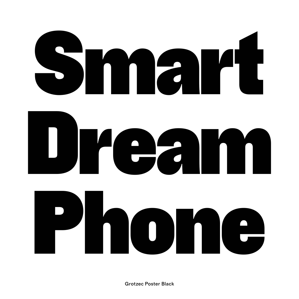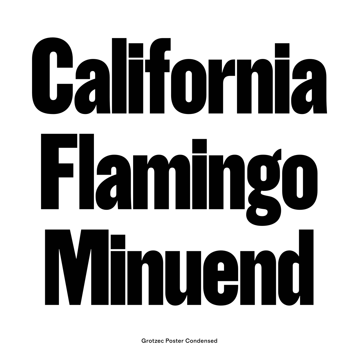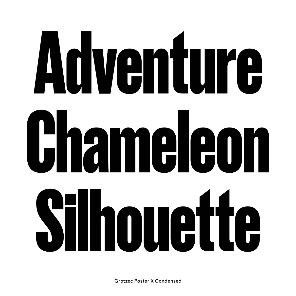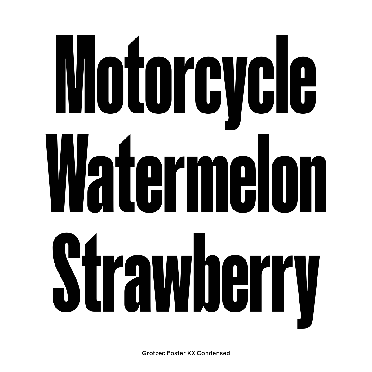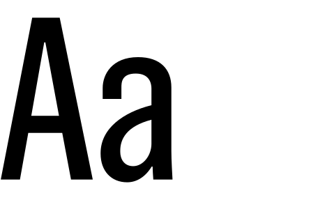
Grotzec Condensed was originally designed for the Surf Portugal magazine while Feliciano was the magazine’s art director. The typeface is inspired by early European grotesques found in late 19th-century posters and advertisement ephemera. While the shapes follow the close models of the time, some formal aspects of Grotzec help the typeface stand out from a typical grotesque typeface. Details such as different curve speeds in the exterior and interior of the letter shapes give the typeface a subtle humanistic touch.
The Grotzec Condensed family has eight different widths that range from Thin to Black with accompanying italics. Grotzec has two additional sub families, Grotzec X Condensed (before known as Grotzec More) with three widths in black weight, and Grotzec Poster designed for really big sizes with four widths also in the black weight.
OpenType Features:
Case-Sensitive Forms
Standard Ligatures
Proportional Lining Figures
Tabular Lining Figures
Numerators
Denominators
Fractions
Ordinals
Stylistic Alternates
Inferiors
Superiors
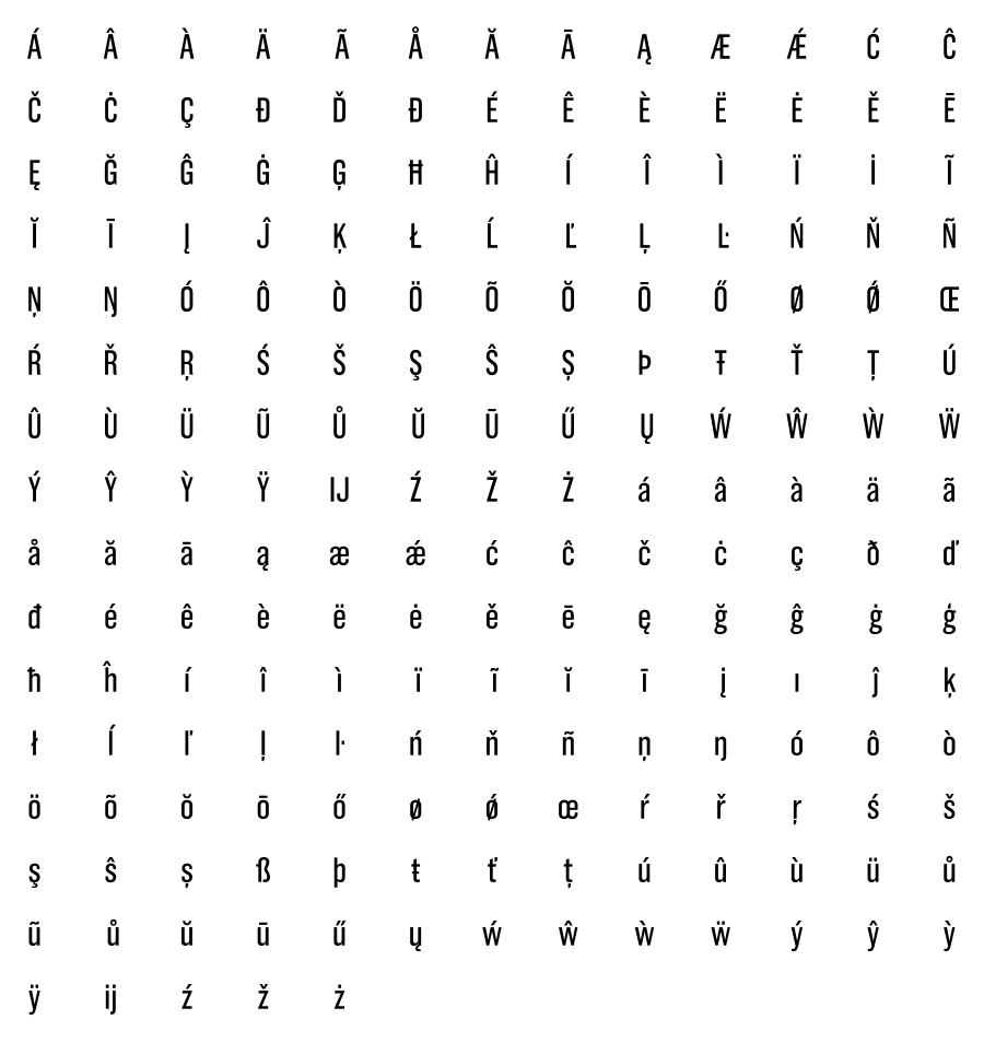
 Accented Characters
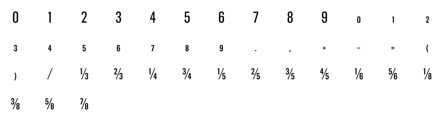
 Numerals / Fractions
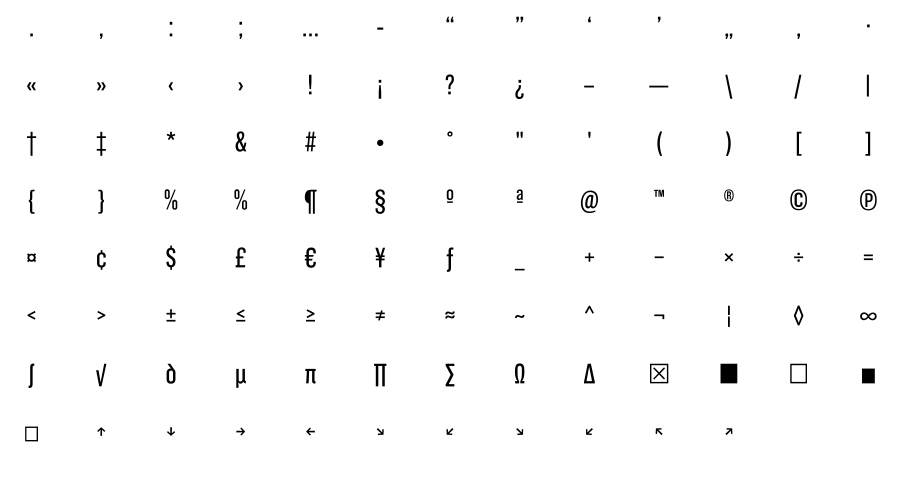
 Punctuation / Symbols
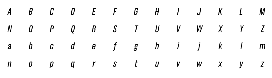
 Italic
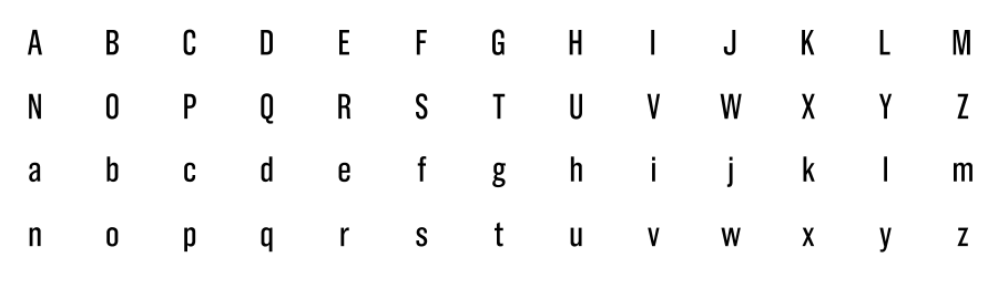
Uppercase / Lowercase
Italic
Uppercase / Lowercase
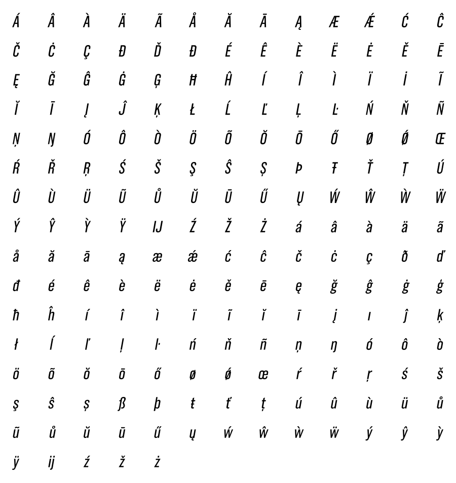
 Accented Characters
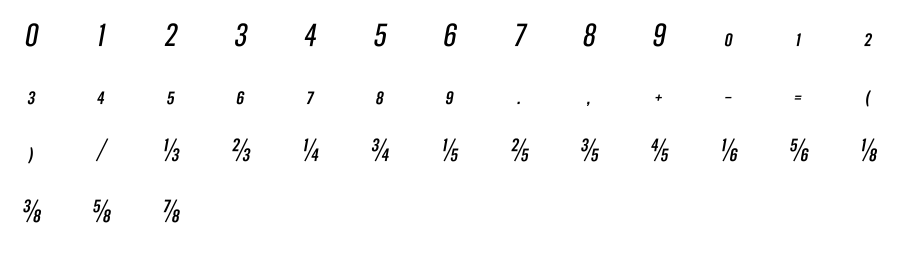
 Numerals / Fractions
 Punctuation / Symbols